ERTECH — BRAND REFRESH
visual identity.
illustration.
print design.
signage & wayfinding.
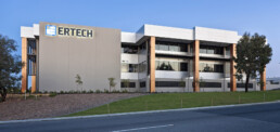
Ertech are Australian and employee-owned civil and electrical construction business that delivers services to a diverse range of industries including civil, electrical, geotechnical and marine piling.
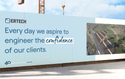
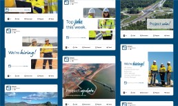
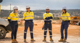
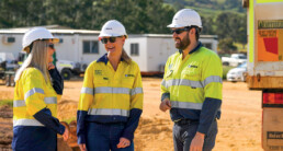
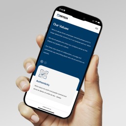
Approaching their 40th year in business, Ertech were looking to refresh their brand for the milestone. Working in partnership with their in-house marketing team, we translated the findings of their internal brand audit into an identity that highlights their employee-owned, collaborative culture while reinforcing their technical expertise. In a sector often perceived as cold and masculine, the new brand takes a more human and authentic approach, positioning the client as both specialists in their field and a business defined by its people.
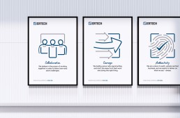
With an extensive range of iconography required, a system was built to ensure every symbol remained consistent and on-brand.
Built on a 3×3 grid system, the icons use a two-tone palette and a loose, brushed stroke to give a human element. The result is a collection that is strong, cohesive and uniquely theirs.